Friday, 20 August 2010

Euro Tripping

So where have I been for the past month?
Well its been a busy one, travelling to 14 places and 11 countries, but who's counting. But my designers eye has been open all the way around and these are some of the good designs i have seen.


Amsterdam

First place we went and right outside our hostel was an ale shop and these gorgeous labels for the bottled beer. Each different range that they had have a simple design and I just loved them. If I hadn't have had a small backpack for 24 days I would have got some of these.


I really liked this poster that was around Amsterdam, I think its fr a film or a play but the quirky illustrations really set it apart from the rest of the movie posters.


Really great little idea to sell individual chocolates in little boxes.


Berlin

We visited the Ritter Sport shop which was amazing, the who interior of the shop was made up of these coloured squares and these little gift boxes are simple and i love them. Even thought i don't think much to the logo as i don't think it represents the brand at all, the identity they have with the colours and squares really works for them.


 While around Berlin we cam across this Palace building and these huge letters outside. They say the name of the area and think its a great way to get peoples attention.


Prague

Very simple sponge letters, have no idea what they say but just came across them in a shopping alley.


Vienna


Budapest

I love these little icons that Dzsem use in their logo. Its a bakery and from this you can tell its a friendly place.


Salzburg

Jam in every flavour, im in heaven, but packaging is lovely, very hand drawn and colourful ad makes the jam seem a bit more special/


Down the Salt mines there was this whole interactive room where things lit up on screens and selections. a really good way to show information as the kids were loving it.


Milan

Fashion central Milan had a few little gems, loved these t-shirts in bottles by Milky wear and the t-shirts wernt bad designs either. If i had 50 euros to spare . . . maybe.

The same store also had t-shirts in bubble wrap envelops, they were of a punk style on the shirts so to a more  younger audience i think.


Luxemburg

Love this typeface, there are loads like it with this Mexican style but i really like the hand drawn element to this one. 


Brussels


Thursday, 19 August 2010

Travelling Blog

Before heading away for our travels around Europe, myself and my house mate Chris got a word press blog up and going. I designed the front end of the blog and Chris built it up for us so that we could blog our days events down.

Now that we are back, its nicely full of stories and photos for everyone to look at, this is the site if you want to have a look.

http://www.chriswillerton.co.uk/europe/

Saturday, 10 July 2010

Logo designs are evolving

From the last set of logos I experimented with, I have developed them further as I decided they weren't quite right. Its so hard trying to get my identity into one logo, what do i want it to say about me? about my practice?

I decided to pick a few aspects of my design that i feel are 'ME', so choosing hand craft, paper and colour i have experimented with a few different designs and actually like these few below. Although the colours need some work i like the look of this B.

Will see what i think about it in a few weeks time . . !


Friday, 9 July 2010

Monday, 5 July 2010

New Designers Part 1


New Designers Part 1 was absolutely breath taking, even though I was shattered after walking around for hours in the greenhouse heat. These are my top 3 most amazing piece i saw, and also the 3 that i would have in my own home.


Leeds College of Art

I love going to then end of year exhibitions at Leeds College, they never disappoints, these are my favourites for me around the whole college but i haven't got any of the designers names so sorry, but if you know who it is let me know and ill get it on here.

This was probably one of my top 5 favourite designers, they had set up the space really nicely to show of the work, and the work was beautiful prints of astrology images.


The way this designer use these light boxes behind these images was a really a really creative way of focusing the attention on them as it was quite a dark corner.


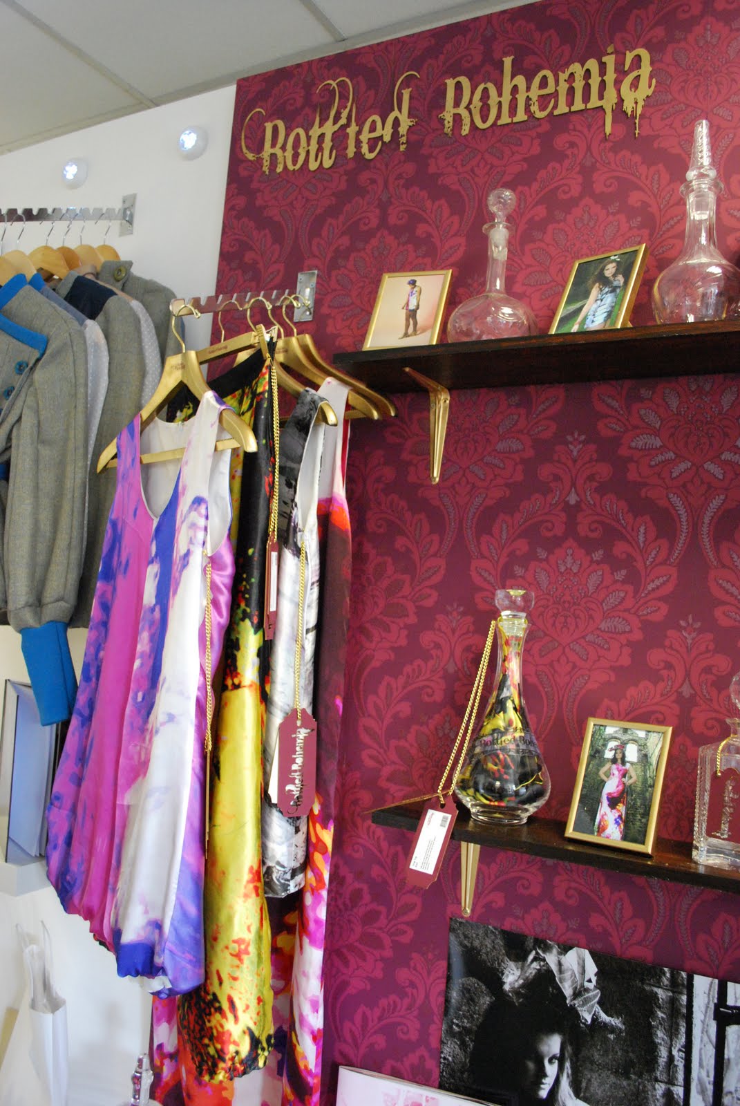
I simply love the exhibition space of this designer, it really complimented the clothes and was just really different from the rest of the room.


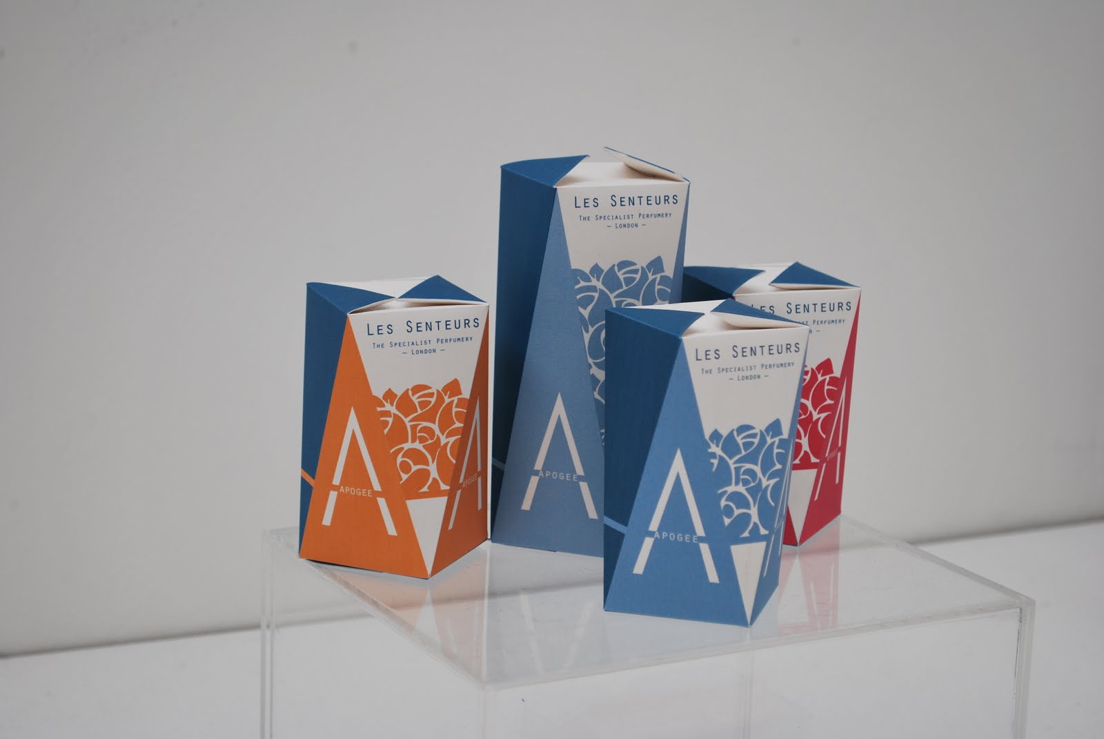
I thought it was great that the Fashion course had exhibited possible packaging for their products, these were really gorgeous tights packaging.


I am always suprised by the effort put into the exhibition space by the designers, and the Millinery course was amazing again this year.


This graphic designers work was so beautiful, i just love the colours they have used.


Who cant love these doughnut packaging, its creative, fun and (for me) a little reminder of the simpsons


Im always a fan of anything typographic but these were simply amazing, they were perfectly crafted with foods that really aren't that easy to control.


Another design based on the solar system (which is always a favourite of mine) but this was much more detail and really beautiful presented, the two colour process makes the whole thing just gorgeous as a whole piece.


After all of the photographic exhibition it was this designer from Visual Communications that really grabbed my eye. I love these photos, they are just great, really bright and great composition.


I cant tell you how much i love this designer (and I do know her name) Nicola Walker, this was my favourite piece, these printed textiles work was so beautiful and detailed. These scenes would create a beautiful piece in a room as a hanging or wallpaper. I WILL be following Nicolas work.


Again these fabrics are beautiful, they are so simple but the colours used are so perfect together.